← Back to work
Tools without the bullshit
Full brand identity for a Swedish tool and hardware distributor.
Proffsverktyg distributes tools into a market where every competitor's logo looks like a hex bolt or a crossed wrench. Reliable, professional, forgettable.
The Brief
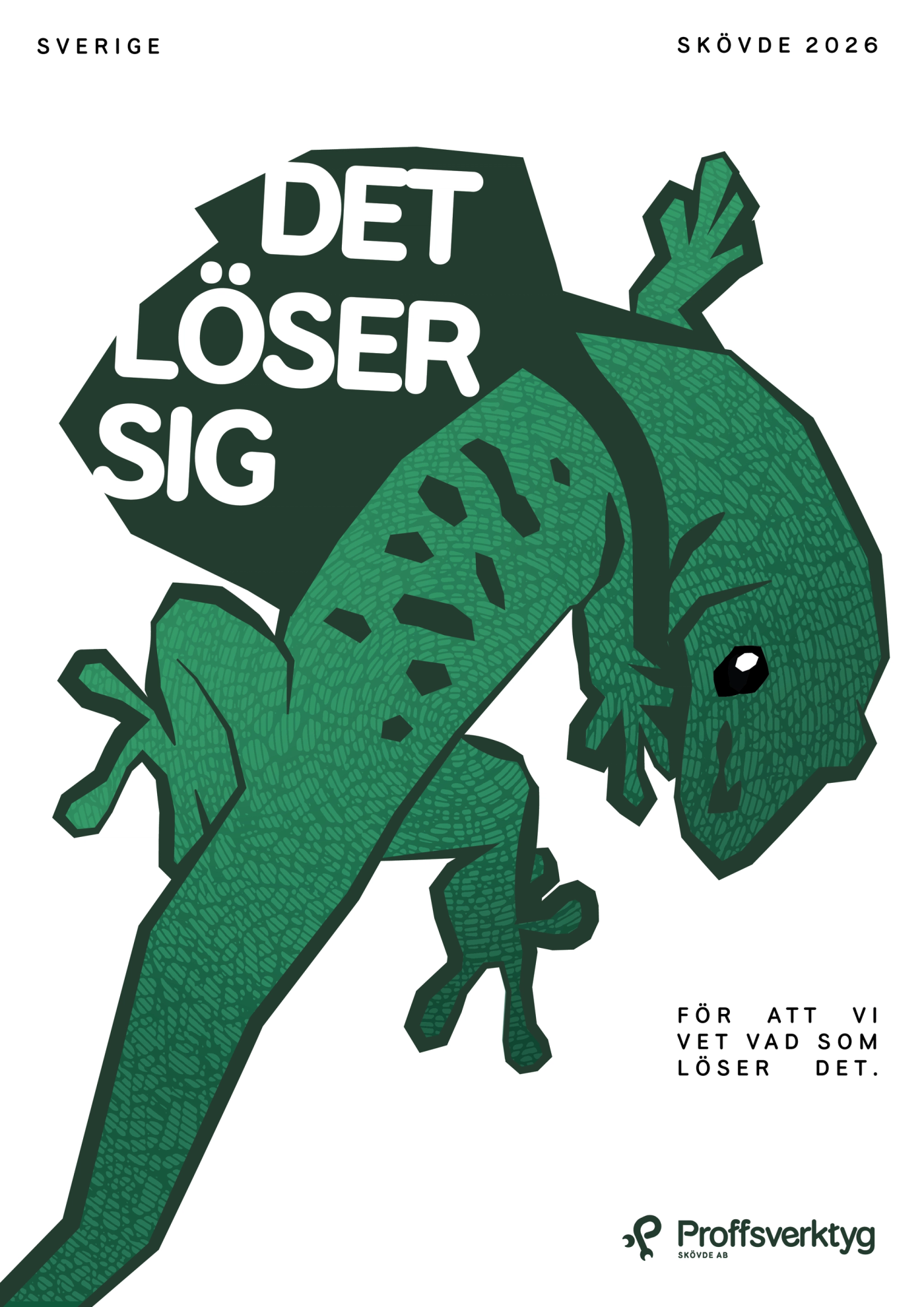
A visual identity strong enough to stand apart in a category built on sameness, without losing an ounce of professionalism.
The Work
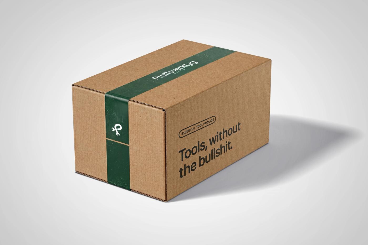
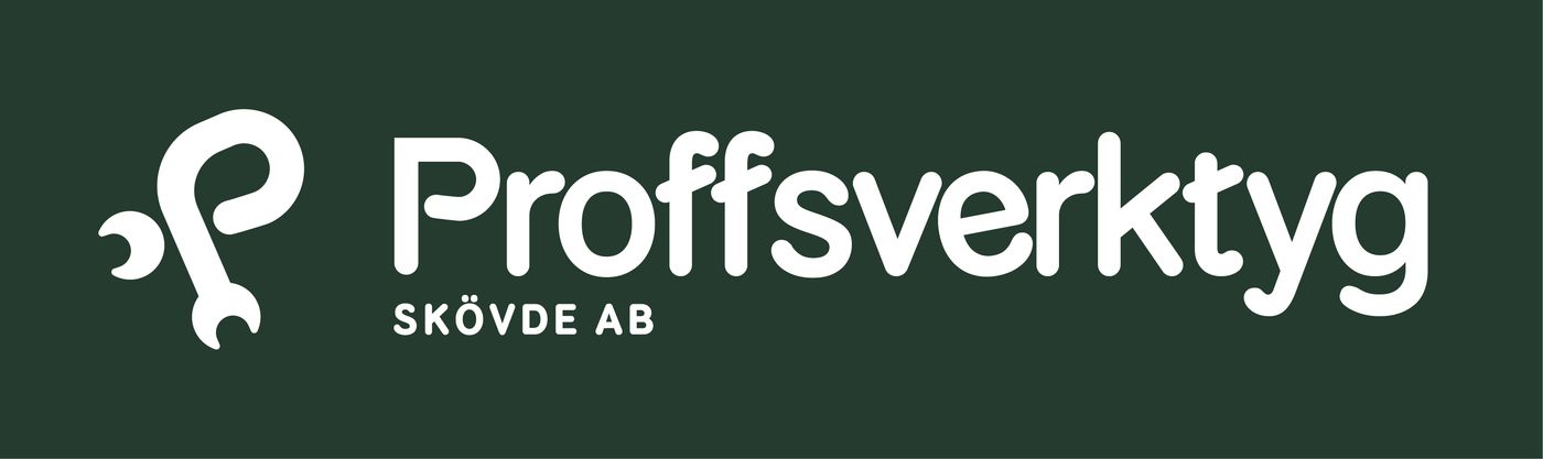
The logo carries the idea: a wrench, bent into the shape of a P. One symbol, two readings, no caption required. A custom typeface built around that letterform, extended into merch and packaging.
The Result
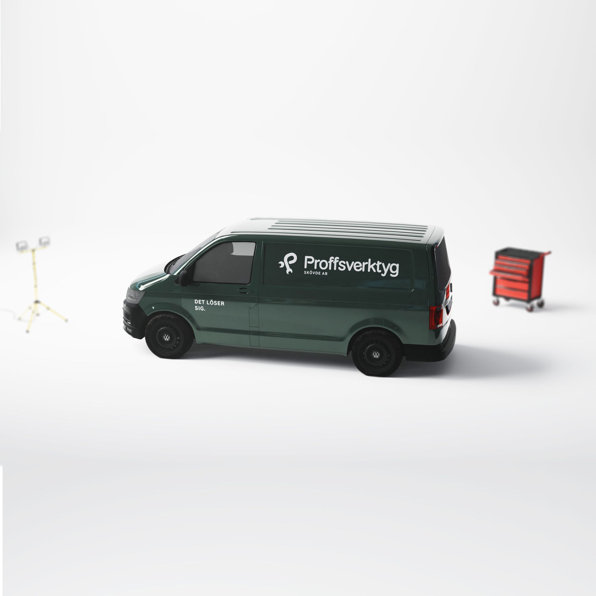
A full identity system built around a single sharp idea. Carried from the logo mark to the shirt on someone's back.