Brainforest
Brainforest Association


Introduction
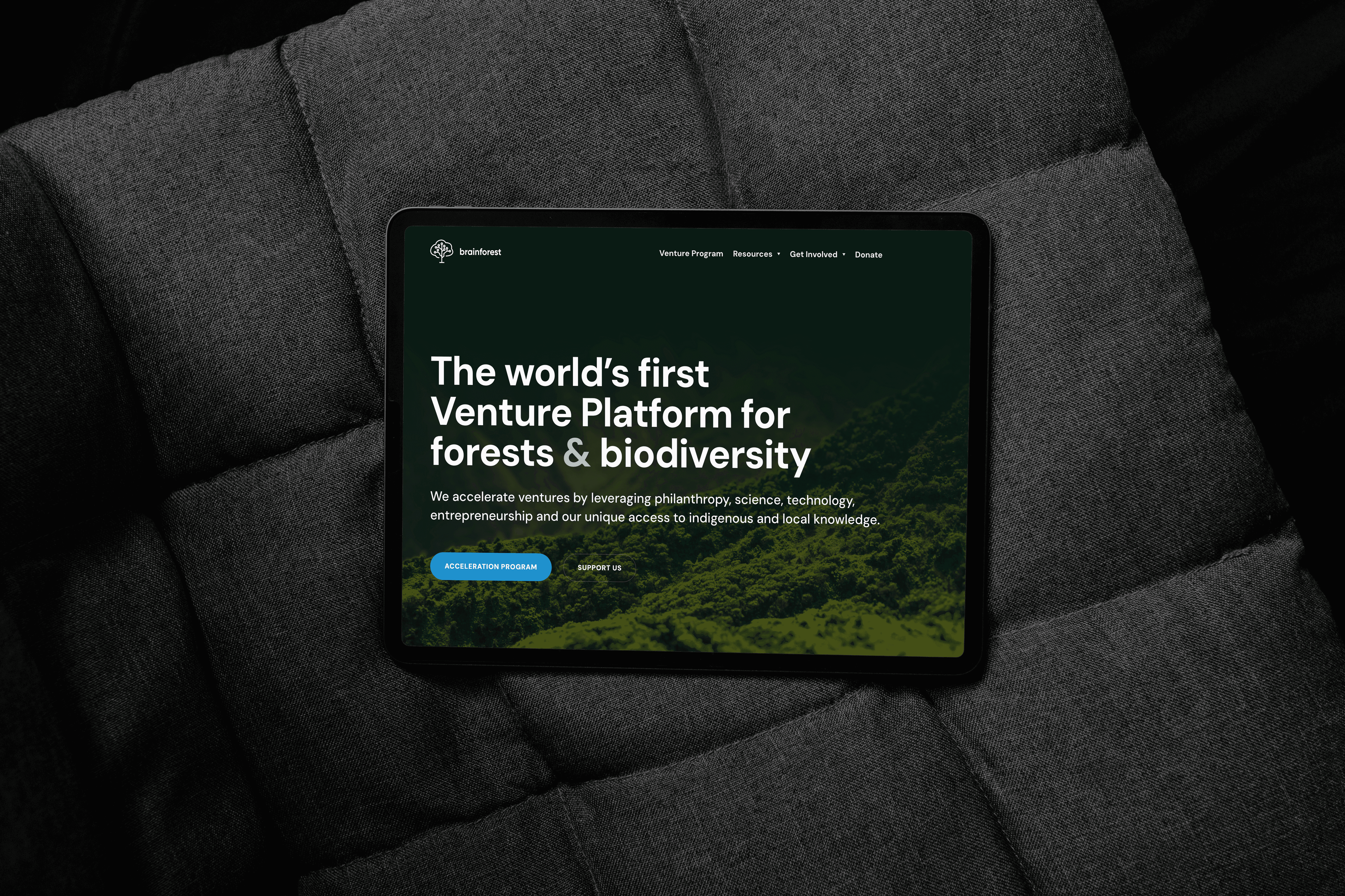
Brainforest is a non-profit accelerator for startups focused on unlocking the full potential of forests and biodiversity.
As the sole designer behind Brainforest’s digital presence, I led a complete reimagining of their brand identity, including a new website, refreshed brand guidelines, social media templates, print collateral, and even refinements to the existing logo – all designed to convey innovation, boldness, and a strong connection to nature.
Description
Conceptual Thinking
The goal was to unify Brainforest’s bold vision with a coherent, intuitive brand experience. Internally, the Brainforest team had a rich story to tell, but externally it often felt complex and hard to digest. My challenge was to distill this complexity without oversimplifying it. I decided to embrace the granularity of their work while presenting it in a more accessible way for new visitors, partners, and investors. This meant developing a visual and structure that could handle depth and clarity simultaneously.
I established a clear narrative arc for the website and communications. Visually, I refreshed the brand’s tone to balance a sense of organic forest energy with the dynamism of a venture accelerator. I developed a new earthy-yet-vibrant color palette, chose modern typefaces, and refined the logo for better consistency across digital platforms. These elements were applied across all touchpoints from web to social media, ensuring a unified identity. I approached the redesign as building a living brand system rather than just making a set of pages. The visual language needed to feel alive and optimistic, yet remain grounded in purpose. Every layout, icon, and interaction was chosen to support this narrative rhythm and guide the user through Brainforest’s value proposition.
Process & Execution
The refresh involved both strategy and design execution. Working closely with Brainforest’s team, I iterated on wireframes and visual style tiles to nail down the right balance of nature-inspired design and professional polish. Once the direction was approved, I moved into full design and implementation: building the website, documenting the brand guidelines, and creating a library of assets.
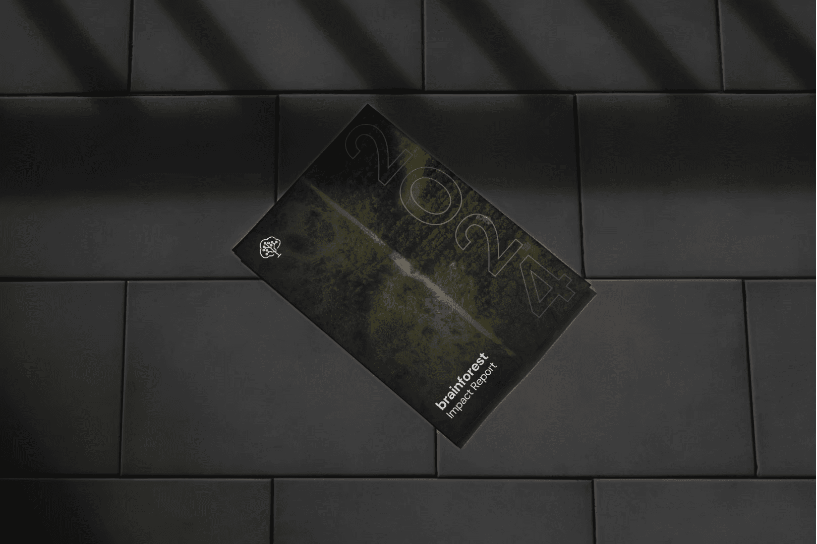
Key deliverables included a completely redesigned website as the central showcase of the new identity, a comprehensive brand guidelines document (covering typography, color usage, imagery, and voice), and a suite of collateral: social media post templates, slide deck designs for presentations, event invitation designs, business cards, and a roll-up banner for events. Throughout the process, I kept everything aligned with the core concept of a “living” system, for example, templates were designed to be easily updatable so the brand could evolve over time. I also set up consistent design elements across print and digital (such as repeating graphic motifs and iconography) to reinforce brand recognition. The result was a cohesive set of materials that all felt part of the same story.
Reflection
The brand refresh elevated Brainforest’s public presence significantly. Complex ideas that once felt overwhelming were now presented in a digestible, story-driven way, and external feedback was very positive. Partners and supporters commented that they finally “get” what Brainforest is about at a glance. For me, this project underlined the power of systems thinking in design. By treating the brand as a living, evolving ecosystem, I enabled Brainforest to maintain consistency even as they continue to grow and add new content.
It was rewarding to see how the new visual identity resonated with both the team and the audience, instilling pride internally and credibility externally. The work is also never truly finished: as part of my ongoing role at Brainforest, I continue to iterate on and expand the design system. This continuous evolution has taught me the value of flexibility in a brand framework, we established strong foundations, but also the guidelines and tools to adapt to new needs. In the end, the project not only improved Brainforest’s clarity of message and external reception, but also gave it a robust base to build upon in the future.